
By Ken Nehrbass
Poor visual design in an LMS can cause users to feel lost, thus impeding learning (Eveland & Dunwoody, 2001). The use and misuse of color is a significant aspect of visual design in an LMS. While psychologists have studied the emotional impact of colors, and the effect that color has on recall and transfer, little research has been done on the influence of visual design (especially color) on students’ experience with an LMS. The small body of literature on the impact of visual design in education does suggest that color can improve student outcomes; however, these outcomes are confounded by other factors such as students’ level of familiarity with the LMS, their motivation for learning, and any loss of vision. The way color is used is also a mediating variable. When color organizes content or signals relevant information, it reduces cognitive load, thus increasing recall. But the use of saturated colors throughout the LMS actually increases cognitive load. Research is mixed on whether cold or warm color schemes are associated with a positive or negative affect.
Information Load
Color can facilitate “cuing”, namely, drawing readers’ attention to important information. Psychologists measure “cuing” by having students read a computer screen while instruments track the participants’ eyes and measure the quickness of responses. (Faster responses indicate lower information complexity, or reduced cognitive load). Stoesz et al. (2020) found that information load was reduced for students (n=29) when there was symmetry on the page, and higher contrast of colors. Boucheix and Lowe (2010) compared outcomes when cuing key information with arrows, a “color spread” and no cuing at all. Participants (n=57) had higher comprehension in the color-cued group. Additionally Özçelik et al. (2010) found that students (n=40) had greater retrieval when colors “signaled” important information.
Retrieval
Colors help with retention and retrieval. Gegenfurtner & Rieger’s (2000) study (n=20) on recall of photos of natural scenes found that realistic color photos lead “to an image coding advantage at the very early stages of sensory processing” (p. 805). This enhanced retrieval may be due to the fact that memory is sensory AND semantic (Dzulkifli and Mustafar, 2013) and colors provide additional sensory input, which is often coded semantically.
The impact of color on emotions
One way we code colors semantically is we attach emotions to various colors. Positive emotional experiences may lead to better learning outcomes; and color contributes to those emotional experiences. For example, Wang et al. (2022) divided students (n=100) into groups with no emotional design, and “colorful emotional designs.” Students in the colorful emotional group scored higher on retention and transfer test scores.
Cyr et al. (2010) found that color acts as a statistically significant moderator for feelings of trust, satisfaction and loyalty. Across cultures, blue was linked to trust, whereas participants found grey and yellow color schemes least satisfactory. Another study on affect and recall of 79 students who viewed lectures with primarily yellow or blue color schemes corroborated this finding (Kumi et al., 2013).[1] In contrast, one study at an Asian university found that “the warm color tone can enhance male learners’ but stifle female learners’ transfer” (Liew, et al., 2022, p. 1).
University Branding in the LMS
Some education leaders have argued that the use of university logos and color schemes in the LMS do project the university values and create a sense of identity (Mirza, 2025). One website claims without evidence that such branding even increases engagement in the LMS (Wright, 2025).
Moderating factors
In a recent survey, students rated color as “moderately important” and didn’t particularly believe it aided in their learning experience (Stoesz and Niknam, 2023). Students especially noted the importance of colorful graphs, tables, and photographs. However, they were more concerned about the navigability of the LMS than the color scheme. Additionally, students with low vision and color blindness do not derive the same benefits from the use of color, and screen readers do not interpret color schemes (Mancilla & Frey, 2021).
Implications for color in the LMS
- Use colors to signal important information in the LMS;
- Use university-branded color schemes to reinforce university values and create a shared identity
- Use color photographs and charts;
- Make sure there is “alt text” to cue readers who are using a screen reader[2]; and,
- Ensure that the LMS is easy to navigate, and that the user experience is consistent from course to course.
Summary
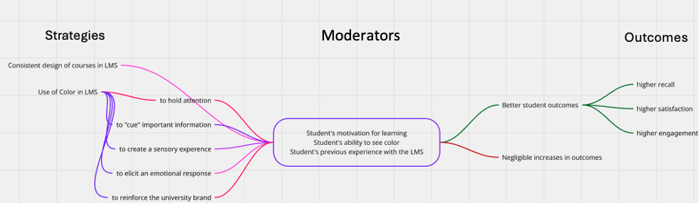
The following colorful infographic depicts the research above by describing two key strategies for a high-quality user experience in an LMS, as well as factors which moderate that experience, and outcomes.
References
Boucheix, J.-M.; Lowe, R.K. (2010). An eye tracking comparison of external pointing cues and internal continuous cues in learning with complex animations. Learning and Instruction, 123–135. https://doi.org/10.1016/j.ijhcs.2009.08.005
Cyr, D.; Head, M.; Larios, H. (2010). Colour appeal in website design within and across cultures: A multi-method evaluation. International Journal of Human-Computer Studies, 68 (1-20), 1-21. https://doi.org/10.1016/j.ijhcs.2009.08.005
Dzulkifli M. and Mustafar M. (2013). The influence of colour on memory performance: a review. Malaysian Journal of Medical Science, 20(2):3-9. https://pmc.ncbi.nlm.nih.gov/articles/PMC3743993/
Eveland Jr., W. P., & Dunwoody, S. (2001). User control and structural isomorphism or disorientation and cognitive load? Learning from the web versus print. Communication Research, 28(1), 48-78. https://doi.org/10.1177/009365001028001002
Gegenfurtner, K. R. & Rieger, J. (2000). Sensory and cognitive contributions of color to the recognition of natural scenes. Current Biology, 10(13), 805–808. https://doi.org/10.1016/S0960-9822(00)00563-7
Kumi, R.; Conway, C.; Limayem, M.; Goyal, S. (2013). Learning in color: How color and affect influence learning outcomes. IEEE Transactions on professional communication, 56 (1), 2-15. 10.1109/TPC.2012.2208390
Liew, T.; Tan, S.; Gan, C. and Pang, W. (2022). Colors and learner’s gender evoke different emotional and cognitive effects in multimedia learning. Human Behavior and Emerging Technologies. https://doi.org/10.1155/2022/1235732
Mirza, A. (2025). Best color combinations for educational websites. https://verpex.com/blog/website-tips/best-color-combinations-for-educational-websites
Özçelik, E.; Arslan-Ari, I.; Cagiltay, K. (2010). Wy does signaling enhance multimedia learning/ Evidence from eye movements. Computers in Human Behavior, 26 (110-117). https://www.sciencedirect.com/science/article/pii/S0747563209001459?via%3Dihub
Stoesz, B.; Niknam, M.; and Sutton, J. (2020). Defining the visual complexity of learning management systems using image metrics and subjective ratings. Canadian journal of Learning and Technology, 46 (2) https://doi.org/10.21432/cjlt27899
Stoesz, B. M., & Niknam, M. (2023). Student Perceptions of the Visual Design of Learning Management Systems. Canadian Journal of Learning & Technology, 49(3), 1–22. https://doi.org/10.21432/cjlt28154
Wang, X.; Mayer, R.; Han, M.; and Zhang L. (2022). Two Emotional Design Features Are More Effective Than One in Multimedia Learning. Journal of educational Computing Research, 60. https://doi.org/10.1177/07356331221090845
Wright, M. (2025). Transforming education through custom branding: A guide to effective design for schools and universities. https://www.mynkis.com/articles/transforming-education-through-custom-branding
[1] This would seem to pose a quandary for a university with gold and blue as the branded colors. Does the positive effect of blue cancel out the negative effect of yellow?
[2] Refer to the Web Accessibility Initiative (WAI) and Section 508 guidelines.